
Analytics and Scheduled Reports
Follow order volume, on-time delivery, revenue and busiest lanes, then generate, export and schedule the reports your team relies on.
These images are illustrations of the concept, not screenshots of the actual product.
Overview
Analytics and Scheduled Reports is how MoveTheWheels turns day-to-day activity into numbers a team can act on and share. Orders, deliveries, driver ratings and revenue are already recorded as work happens, so the concept does not ask anyone to assemble a spreadsheet. It offers one page for live analysis and one for producing and distributing reports on a regular cadence.
The analytics illustration opens with a date-range selector and four headline tiles: order volume with its change against the previous period, on-time delivery percentage, customer satisfaction and average driver rating. An order and delivery trend chart overlays the two series over time, making gaps between what was ordered and what was delivered easy to spot. Below it sit a revenue-by-month bar chart, an orders-by-status donut and a top lanes by volume table listing lanes with order counts and volumes.
The reports illustration handles the output side. A date range and a Create Report button sit above a set of report templates: orders summary, fleet utilization, finance and revenue, customer activity and inventory levels. Each can be generated on demand or downloaded as CSV, and a preview panel shows the tabular report with a download control. A Scheduled reports table lists recurring reports with their cadence, number of recipients, next run date and an activation toggle, so a weekly or monthly report can be switched on or paused without rebuilding it.
Because the figures come from the same order, fleet, inventory and finance records used everywhere else in the product, the design is meant to keep dashboards and reports consistent with what operations teams see in the control tower and what finance reconciles later.
What this concept shows
- Headline tiles for order volume, on-time delivery, customer satisfaction and average driver rating
- A date-range selector that sets the analysis window
- An order and delivery trend chart comparing two series over time
- Revenue by month, orders by status and top lanes by volume
- Report templates for orders, fleet utilization, finance and revenue, customer activity and inventory levels
- On-demand generation and CSV download for each report, with a preview panel
- A scheduled reports table with cadence, recipients, next run and an activation toggle
How it works
- Open Analytics and choose a date range.
- Read the headline tiles and the order and delivery trend to spot shifts in performance.
- Break results down by month, by order status and by the busiest lanes.
- Go to Reports, pick a template and generate it or download it as CSV.
- Schedule the report with a cadence and recipients, and toggle it on or off as needs change.
Who it's for
- Operations and supply chain leaders
- Logistics and fleet managers
- Finance and revenue teams
- Business analysts
- Customer service leads
Illustrations
2 illustrations of this concept. Select one to view it full size.
Operational Analytics Dashboard
This illustration shows the Analytics page with a date-range selector set to the last 30 days. Four tiles present order volume with a percentage change, on-time delivery as a percentage, customer satisfaction and average driver rating, both shown with stars. A wide Order and delivery trend chart overlays orders and deliveries as two shaded area lines over a series of dates, with a legend identifying each. The lower row holds three panels: Revenue by month as paired bars across the months of a year, Orders by status as a donut chart with a legend, and Top lanes by volume as a small table with lane, order and volume columns. All figures are sample data. The design demonstrates how an operations lead can move from headline performance to the trend behind it and then to specific lanes, all within one page and one time window.
Report Generation and Scheduling
This illustration shows the Reports page, subtitled generate and schedule reports, with a date-range picker and a Create Report button. Five template cards cover orders summary, fleet utilization, finance and revenue, customer activity and inventory levels, each with an icon, a short description and a pair of Generate and Download CSV buttons. To the right, a preview panel shows a generated orders summary as a compact data table with a download button beneath it. Lower on the page, a Scheduled reports table lists report name, cadence (weekly or monthly), number of recipients, next run date and an Activate toggle for each schedule. Dates and counts are sample data. The design demonstrates how recurring reporting can be set up once and then delivered automatically to the right people, while still allowing an ad hoc report or export when needed.
Topics
- logistics analytics dashboard
- on-time delivery rate
- order volume trends
- freight revenue by month
- top lanes by volume
- logistics KPIs
- scheduled reports
- CSV export reports
- fleet utilization report
- inventory levels report
Related concepts
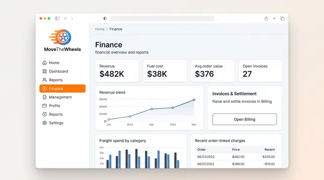
Finance and Freight Document Reconciliation
See revenue, fuel cost and freight spend at a glance, then check carrier invoices against shipments, agreed rates and delivery proof.
2 illustrations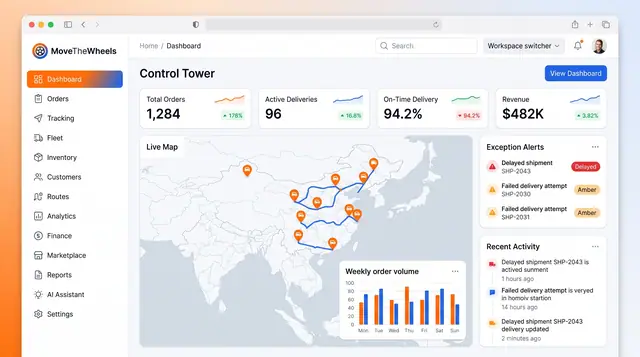
Control Tower Dashboard
One home screen for the whole network: headline KPIs, a live map of moving freight, open exceptions and the latest activity.
2 illustrations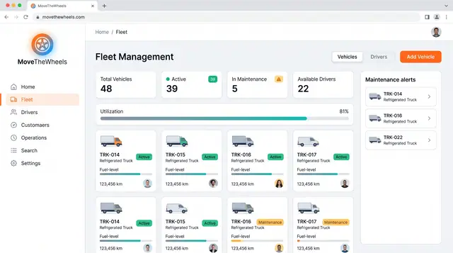
Fleet and Driver Management
See every vehicle and driver in one place: status, utilization, maintenance, documents and who is assigned to what.
3 illustrations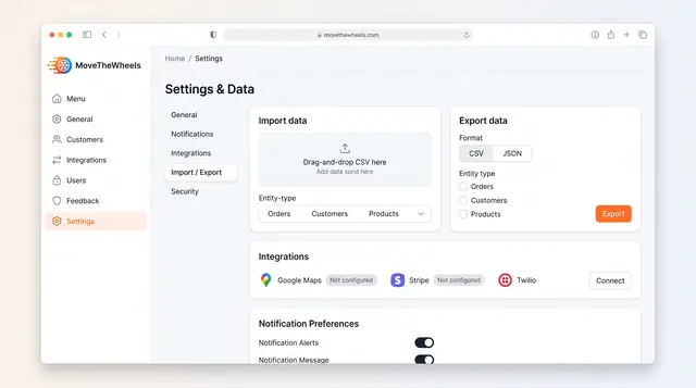
Data Import, Export and Integrations
Bring orders, customers and products in from CSV, export them as CSV or JSON, and connect maps, payments and messaging services.
1 illustration